This is an exploration on distribution of scholarships. The data is not publicly available and I have created fantasy labels/names to mask sensitive information.
Throughout the analysis, I have not shown any head() or sample() so the content of the data remains unknown.
The data-set includes applications for a scholarship. Each row is an application and includes information such as an applications ID, the name of the applicant, the discipline of the proposed research project, the host university, the project title, and, crucially, the status of the application: whether it is successful or not.
The idea of this analysis is to visualise how the scholarships are distributed across disciplines and universities.
Cleaning the data
First, I will import the libraries that I need, and then I will import the data from the excel file.
import pandas as pd
import numpy as np
import matplotlib.pyplot as plt
import seaborn as sns
xl = pd.ExcelFile("scholarships_data_file.xls")
df = xl.parse("Sheet1")
df.info()
RangeIndex: 6584 entries, 0 to 6583
Data columns (total 10 columns):
Project ID                                      6584 non-null object
Applicant                                       6584 non-null object
Gender                                          6584 non-null object
Status                                          6584 non-null object
Institution                                     6584 non-null object
Primary area                                    6584 non-null object
Sub Discipline                                  6582 non-null object
Second categorisation – if interdisciplinary    1894 non-null object
Project title (searchable)                      6572 non-null object
Unnamed: 9                                      0 non-null float64
dtypes: float64(1), object(9)
memory usage: 514.5+ KB
So, let’s see what these columns are:
Project ID: Each application has an ID saved in the column Project ID in the format: Scheme Code/YEAR/Application number, this identifies each application.
This is useful for keeping anonymity in a fair review/assessment process. For my purposes, all I want from Project ID is the year in which the application was submitted.
I will convert this into Year shortly.
Applicant: This is the name of the applicant.
Gender: The applicant’s gender. The options are Female, Male or Other. As I will show below, only a very few people identified as other.
Status: Because the data includes previous rounds of the funding scheme, there are “past award holders”, that is successful people that obtained the scholarship in previous years. Currently successful candidates are “conditional award”, and there are other further values for status. In a first approach I will take just two groups: successful and unsuccessful applications.
Institution: Which higher education institution is the proposed project going to be held.
Primary area: This is a set of broad disciplines, such as computer sciences or study of the human past.
Sub discipline: This is a specific discipline, such as history, archeology or molecular biology.
Second categorisation… : Some projects may be inter-/multi- disciplinary, and this column has other related disciplines (that may be from the same primary area than the main discipline or not). I will ignore this for now.
Project title: This is the title for the proposed project.
Unnamed: 9: This is a glitch in the data mining process that I can easily fix:
df.drop('Unnamed: 9', axis = 1, inplace = True)
Now, looking again at df.info(), we see that there are two entries without a sub-discipline. The dataset has missing values, but the actual application (submitted in print or though a web-platform) does have a value. So in this case, I need to see in detail those entries to find out what are and fill out the empty cell.
np.where(pd.isnull(df['Sub Discipline']))
(array([1425, 2900], dtype=int64),)
Looking at those specific applications, I figure out the right value and fill out the dataframe:
df.iloc[1425]['Sub Discipline'] = 'Cell Biology'
df.iloc[2900]['Sub Discipline'] = 'Information Systems'
This command will strip off everything before and after the /:
df['Project ID'] = df['Project ID'].str.split('/').str[1]
Now I will change the name to Year.
df.rename(columns={'Project ID':'Year'}, inplace=True)
df.Year.unique()
array(['2013', '2014', '2015', '2016', '2017', '2018'], dtype=object)
How many institutions and primary areas do we have?
len(df.Institution.unique())
28
len(df['Primary area'].unique())
11
len(df['Sub Discipline'].unique())
108
There are many sub-disciplines. In this exploratory analysis I will only consider the Primary area. I will leave looking at Sub Discipline for future exercises.
df.info()
RangeIndex: 6584 entries, 0 to 6583
Data columns (total 9 columns):
Year                                            6584 non-null object
Applicant                                       6584 non-null object
Gender                                          6584 non-null object
Status                                          6584 non-null object
Institution                                     6584 non-null object
Primary area                                    6584 non-null object
Sub Discipline                                  6584 non-null object
Second categorisation – if interdisciplinary    1894 non-null object
Project title (searchable)                      6572 non-null object
dtypes: object(9)
memory usage: 463.0+ KB
The features Second categorisation – if interdisciplinary and Project title (searchable) will not be necessary, so I will just leave them as they are.
Analysis first steps
The core of this is to separate the applications between successful and unsuccessful. However, there are various values for the feature Status. These correspond to past award holders, declined awards, current awards, conditional awards, and so on. I will set a criterion to divide all the existing statuses into two categories: award and failed.
First, let’s list the application status possible values:
df.Status.unique()
array(['Past Award Holder', 'Application Unsuccessful', 'Award Declined',
       'Awards Terminated', 'Award Holder', 'Conditional Award',
       'Reserve'], dtype=object)
Now I will create the success (or awarded) and failure/unsuccessful categories.
Awardee = ['Past Award Holder','Award Holder', 'Conditional Award', 'Awards Terminated']
# All these can be considered successes/awards

Unsuccessful = [ 'Application Unsuccessful', 'Award Declined', 'Reserve']
# All these can be considered failed/unsuccessful

Total = Awardee+Unsuccessful
I check whether I missed a value for the Status column (I’m sure there are more sophisticated methods to compare lists, but at this time I’m happy and confident enough with the following):
len(Awardee)+len(Unsuccessful)
7
len(df.Status.unique())
7
Now I want to create one dataframe that includes all the projects that I consider as successful and one dataframe for the unsuccessful projects:
This will classify all of the data into two groups, because it is a first approach.
Later on, I will come back to this, and see whether applicants applied more than once before being successful, and how that factors in general.
awards = df.loc[(df['Status'].isin(Awardee))]
unsuccessful  = df.loc[(df['Status'].isin(Unsuccessful))]
The basic type of analysis that I will make include comparing the number of applications, the number of awards and a measure of success.
I will use this approach to visualise the data from the point of view of universities, disciplines, gender.
The data has each application and its status, so in order to have a measure of success, I need to define a new variable. I will create a success rate, which is calculated as the percentage of successes over the total of applications.
Success rate = 100 * number of successful applications divided by total number of applications
The success rate is crucial and I will use it in many different ways: what’s the success rate for each discipline, or for each university, or by gender, etc.
pandas groupby() and count() will be of great help here.
Distribution of total applications, awards and the success rate per year
First, I would like to plot for each year the total number of applications (successful and unsuccessful), awards and the associated success rate. This will give a first impression of the distribution of scholarships. Subsequent analysis shall be compared against this one in order to draw stronger conclusions.
awards_Y = awards.groupby('Year').count()
awards_Y.rename(columns={'Status':'No_Awards'}, inplace=True)
awards_Y.reset_index(inplace=True)
apps_Y = df.groupby(["Year"] ).count()
apps_Y.rename(columns={'Status':'No_Apps'}, inplace=True)
apps_Y.reset_index(inplace=True)
suc_rate_Y = 100*awards.groupby(["Year"] ).count()/df.groupby(["Year"]).count()
suc_rate_Y.rename(columns={'Status':'Suc_Rate'}, inplace=True)
suc_rate_Y.reset_index(inplace=True)
fig, (ax3, ax2, ax1) = plt.subplots(1,3, figsize=(15,3))

ax1.set_facecolor((1, 1, 1))
ax1.grid(color='gray', linestyle='-', linewidth=0.5)
ax2.set_facecolor((1, 1, 1))
ax2.grid(color='gray', linestyle='-', linewidth=0.5)
ax3.set_facecolor((1, 1, 1))
ax3.grid(color='gray', linestyle='-', linewidth=0.5)


ax1.spines["top"].set_visible(False)
ax1.spines["bottom"].set_visible(False)
ax1.spines["right"].set_visible(False)
ax1.spines["left"].set_visible(False)


ax2.spines["top"].set_visible(False)
ax2.spines["bottom"].set_visible(False)
ax2.spines["right"].set_visible(False)
ax2.spines["left"].set_visible(False)


ax3.spines["top"].set_visible(False)
ax3.spines["bottom"].set_visible(False)
ax3.spines["right"].set_visible(False)
ax3.spines["left"].set_visible(False)

ax1.plot(suc_rate_Y.Year, suc_rate_Y.Suc_Rate, marker='o', markersize=12, lw=1.5)

ax2.plot(awards_Y.Year, awards_Y.No_Awards, marker='o', markersize=12, lw=1.5)

ax3.plot(apps_Y.Year, apps_Y.No_Apps, marker='o', markersize=12, lw=1.5)

ax1.set_title('Success rates (%)', fontsize=19)
ax2.set_title('Number of awards', fontsize=19)
ax3.set_title('Number of applications', fontsize=19)


plt.setp(ax1.get_xticklabels(), fontsize=14)
plt.setp(ax1.get_yticklabels(), fontsize=14)
plt.setp(ax2.get_xticklabels(), fontsize=14)
plt.setp(ax2.get_yticklabels(), fontsize=14)
plt.setp(ax3.get_xticklabels(), fontsize=14)
plt.setp(ax3.get_yticklabels(), fontsize=14)

start3, end3 = ax3.get_ylim()
ax3.yaxis.set_ticks(np.arange(960, end3+1, 30))

start2, end2 = ax2.get_ylim()
ax2.yaxis.set_ticks(np.arange(200, end2+1, 10))


start1, end1 = ax1.get_ylim()
ax1.yaxis.set_ticks(np.arange(17, end1+1, 1))

plt.setp(ax1, yticks=np.arange(16, 23, step=2)) #suc_rate

fig.subplots_adjust(hspace=0.35)
plt.text(-14,14.5, "Source: Council. May 2018.", fontsize=12)

fig.suptitle("Scholarship 2013-2018", y =1.1, fontsize=16)
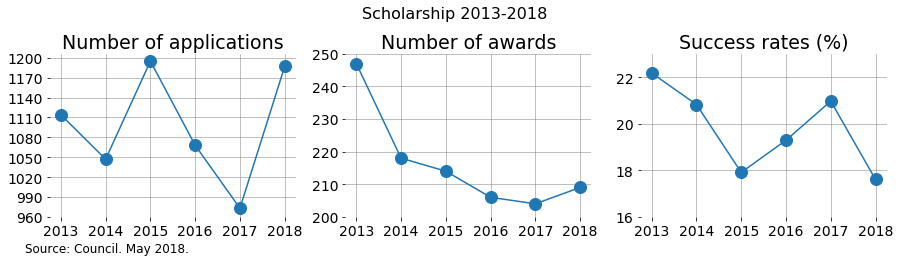
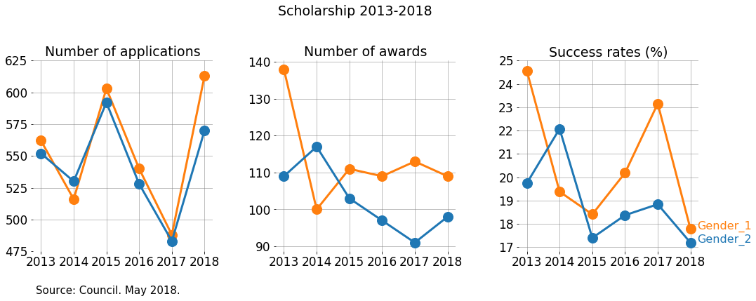
While there was an increase in awards in 2018 compared with 2018, the success rate still decreased! This is because the number of applications in that same period changed a lot more.
It’s interesting to appreciate the decreasing trend in number of awards in 2013-2017 and how 2018 was slightly better.
What happened?
- Is this a matter of available funding?
- Was the quality of the applications different?
- Were the panels more demanding?
Analysis by Primary Area
How successful is each primary area, and how does it change in time?
As I showed before, there are 11 primary areas and the years run 2013-2018.
discipline_suc_rate = 100*awards.groupby([ "Year", "Primary area"]).count()/df.groupby(["Year", "Primary area"] ).count()
discipline_suc_rate.rename(columns={'Applicant':'Suc_Rate'}, inplace=True)
discipline_suc_rate.reset_index(inplace=True)
Now I want to count the number of applications and number of awards for each primary area per year.
discipline_apps = df.groupby(["Year", "Primary area"] ).count()
discipline_apps.rename(columns={'Applicant':'No_Apps'}, inplace=True)
discipline_apps.reset_index(inplace=True)
discipline_awards = awards.groupby(["Year", "Primary area"] ).count()
discipline_awards.rename(columns={'Applicant':'No_Awards'}, inplace=True)
discipline_awards.reset_index(inplace=True)
For creating the following plot, I used an idea from Randal S. Olson’s blog.
fig, (ax2, ax1, ax3) = plt.subplots(1,3, figsize=(25,6))


ax1.set_facecolor((1, 1, 1))
ax1.grid(color='gray', linestyle='-', linewidth=0.6)
ax2.set_facecolor((1, 1, 1))
ax2.grid(color='gray', linestyle='-', linewidth=0.6)
ax3.set_facecolor((1, 1, 1))
ax3.grid(color='gray', linestyle='-', linewidth=0.6)


ax1.spines["top"].set_visible(False)
ax1.spines["bottom"].set_visible(False)
ax1.spines["right"].set_visible(False)
ax1.spines["left"].set_visible(False)


ax2.spines["top"].set_visible(False)
ax2.spines["bottom"].set_visible(False)
ax2.spines["right"].set_visible(False)
ax2.spines["left"].set_visible(False)


ax3.spines["top"].set_visible(False)
ax3.spines["bottom"].set_visible(False)
ax3.spines["right"].set_visible(False)
ax3.spines["left"].set_visible(False)

plt.tick_params(axis="both", which="both", bottom="off", top="off",
                labelbottom="on", left="off", right="off", labelleft="on")

# Tableau20 colors
tableau20 = [(23, 190, 207), (31, 119, 180),  (255, 187, 120), (148, 103, 189),
             (44, 160, 44), (152, 223, 138), (174, 199, 232),
             (255, 127, 14),(214, 39, 40), (255, 152, 150),
             (197, 176, 213), (140, 86, 75), (196, 156, 148),
             (227, 119, 194), (127, 127, 127), (199, 199, 199),
             (188, 189, 34), (219, 219, 141),  (158, 218, 229)]


# Scale the RGB values to the [0, 1] range, which is the format matplotlib accepts.
for i in range(len(tableau20)):
    r, g, b = tableau20[i]
    tableau20[i] = (r / 255., g / 255., b / 255.)


majors = sorted(discipline_apps['Primary area'].unique())


for rank, column in enumerate(majors):


###### Number of applications #####
    data_Ap = discipline_apps[(discipline_apps['Primary area'] == column)]
    ax2.plot(data_Ap.Year, data_Ap.No_Apps, marker='o', markersize=15, lw=2.5,
                 color=tableau20[rank])
    y_pos_Ap = discipline_apps[(discipline_apps['Primary area'] == column) &
                                  (discipline_apps['Year'] == '2018')]

###### Number of awards #####
    data_Aw = discipline_awards[(discipline_awards['Primary area'] == column)]
    ax1.plot(data_Aw.Year, data_Aw.No_Awards, marker='o', markersize=15, lw=2.5,
                 color=tableau20[rank])
    y_pos_Aw = discipline_awards[(discipline_awards['Primary area'] == column) &
                                  (discipline_awards['Year'] == '2018')]
###### Success Rate #####
    data_Suc = discipline_suc_rate[(discipline_suc_rate['Primary area'] == column)]
    ax3.plot(data_Suc.Year, data_Suc.Suc_Rate, marker='o', markersize=15, lw=2.5,
                 color=tableau20[rank])
    y_pos_Suc = discipline_suc_rate[(discipline_suc_rate['Primary area'] == column) &
                                  (discipline_suc_rate['Year'] == '2018')]
    x_pos_Suc = 5.4
    if (column == 'Physics'):
        y_pos_Suc['Suc_Rate'].values[0] += 2.5
    if (column == 'Study of the Human Past'):
        y_pos_Suc['Suc_Rate'].values[0] -= 2
    if (column == 'Cultures and Cultural Production'):
        y_pos_Suc['Suc_Rate'].values[0] += 1
    if (column == 'Engineering'):
        y_pos_Suc['Suc_Rate'].values[0] -= 1.5
    if (column == 'Biological Sciences A'):
        y_pos_Suc['Suc_Rate'].values[0] -= 3
    if (column == 'Biological Sciences B'):
        y_pos_Suc['Suc_Rate'].values[0] -= 1
    ax3.text(x_pos_Suc, y_pos_Suc['Suc_Rate'].values[0], 'Primary area ' + str(rank), color=tableau20[rank], fontsize=21)

plt.setp(ax1.get_xticklabels(), fontsize=22)
plt.setp(ax1.get_yticklabels(), fontsize=22)
plt.setp(ax2.get_xticklabels(), fontsize=22)
plt.setp(ax2.get_yticklabels(), fontsize=22)
plt.setp(ax3.get_xticklabels(), fontsize=22)
plt.setp(ax3.get_yticklabels(), fontsize=22)

fig.suptitle('Scholarship 2013-2018', y =1.1, fontsize=23)
ax1.set_title('Number of awards', fontsize=22)
ax2.set_title('Number of applications', fontsize=22)
ax3.set_title('Success rates (%)', fontsize=22)


plt.setp(ax3, yticks=np.arange(5, 45, step=5))
plt.setp(ax1, yticks=np.arange(0, 85, step=10))
plt.setp(ax2, yticks=np.arange(0, 450, step=50))


plt.text(-13, -4, "Source: Council. May 2018.", fontsize=19)
Text(-13,-4,'Source: Council. May 2018.')
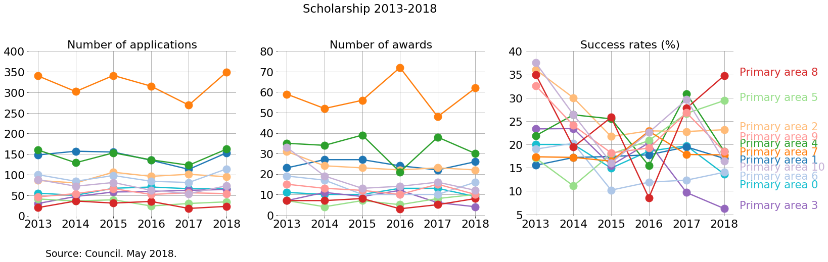
How to analyse this? This plot allows us to easily recognise which primary areas are more populated, and how they change compared to themselves in time and how they are compared with other primary areas.
Ideally, a funding agency that supports research in all disciplines the same would find a stable success rate for all disciplines. Changes in success rate indicate something interesting to look at in terms of how the applications are evaluated.
One way to view these plots is to consider, for each primary area, the changes in time across each subplot. Consider just two cases:
-
Primary area 0 is relatively stable in number of applications. In particular, in 2017 the number of applications decreased. However, the number of awards in 2017 was higher than in 2016. And considering that it has relatively low numbers, this is expressed as a significant change in the success rate in 2016-2017.
-
The success rate of Primary area 7 has a peak in 2016. In that year the number of awards grew compared with previous year, and it grew while the number of applications had decreased.
-
Primary area 8 seems to change abruptly in success rate. This is due to having low numbers. A change of a few awards/applications can hugely change the success rate if numbers are small.
Another way is to compare the relative order in which the primary areas appear in each subplot.
- Now look at the order in which the primary areas appear. The increase of number of awards for primary area 7 is similar to the decrease of awards for primary area 4 in 2016. However, the number of applications for both primary areas remain relatively stable compared to 2015. Maybe something happened here: maybe the panel of 2016 had a bias
One can also compare this plots with the global ones made above:
- 2017 had a low number of applications compared with 2016. So, in 2017 there are some primary areas that follow this trend, while others, such as primary area 2, don’t.
Global success rate by Gender
Now I will carry out the same analysis, but in terms of gender. First, I will visualise the successes and failures for each gender for the whole period 2013-2018.
suc_rate_G = 100*awards.groupby(["Gender"] ).count()/df.groupby(["Gender"]).count()
suc_rate_G.rename(columns={'Status':'Suc_Rate'}, inplace=True)
suc_rate_G.reset_index(inplace=True)
apps_G = df.groupby(["Gender"] ).count()
apps_G.rename(columns={'Applicant':'No_Apps'}, inplace=True)
apps_G.reset_index(inplace=True)
awards_G = awards.groupby(["Gender"] ).count()
awards_G.rename(columns={'Status':'No_Awards'}, inplace=True)
awards_G.reset_index(inplace=True)
awards_G = awards.groupby(["Gender"] ).count()
awards_G.rename(columns={'Status':'No_Awards'}, inplace=True)
awards_G.reset_index(inplace=True)
failed_G = unsuccessful.groupby(["Gender"] ).count()
failed_G.rename(columns={'Status':'No_Unsuccessful'}, inplace=True)
failed_G.reset_index(inplace=True)
I used a post by Kevin Amipara that I liked to make pie charts.
# This is the data that I will plot

labels = ['Awarded', 'Unsuccessful']
explode = (0,0)
sizes = [1298, 5286]

labels_gender = ['Gender 2', 'Gender 1', 'Other', 'Gender 2','Other', 'Gender 1']
explode_gender = (0,0,0,0, 0,0)
sizes_gender = [615,680,3,  2640,4,2642]

#colors
colors = [(255/255, 152/255, 150/255), (197/255, 176/255, 213/255)]
colors_gender = ['#1F77B4','#FF7F0E', 'r', '#1F77B4','r','#FF7F0E']

def make_autopct(values):
    def my_autopct(pct):
        total = sum(values)
        val = int(round(pct*total/100.0))
        # return '{p:.2f}%  ({v:d})'.format(p=pct,v=val)
        return '{v:d}'.format(v=val)
    return my_autopct

def make_autopct_pct(values):
    def my_autopct(pct):
        total = sum(values)
        val = int(round(pct*total/100.0))
        # return '{p:.2f}%  ({v:d})'.format(p=pct,v=val)
        return '{p:.2f}%'.format(p=pct)
    return my_autopct

#Plot

patches_s, texts_s,autotexts_s  = plt.pie(sizes, labels=labels, colors=colors, startangle=0,
                                          explode=explode,radius=4, autopct=make_autopct(sizes),
                                          pctdistance=1.3, labeldistance=1.6)

patches_g, texts_g,autotexts_g  = plt.pie(sizes_gender,labels=labels_gender, colors=colors_gender,
                                          startangle=0,pctdistance=0.8,labeldistance=1.1, explode=explode_gender,radius=3,
                                          autopct=make_autopct_pct(sizes_gender))


#Draw circle
centre_circle = plt.Circle((0,0),1.4,color='black', fc='white',linewidth=0.2)
fig = plt.gcf()
fig.gca().add_artist(centre_circle)


from matplotlib import font_manager as fm

proptease = fm.FontProperties()
proptease.set_size('large')
plt.setp(autotexts_s, fontproperties=proptease)
plt.setp(texts_s, fontproperties=proptease)

proptease_g = fm.FontProperties()
proptease.set_size('medium')
plt.setp(autotexts_g, fontproperties=proptease_g)
plt.setp(texts_g, fontproperties=proptease)

plt.axis('equal')
plt.tight_layout()

fig.suptitle('Scholarship 2013-2018', fontsize=15)

plt.text(-4, -5, "Note: a small number of applicants identified their gender as \"Other\"." "\n"
         "Source: Council. May 2018.", fontsize=12)
Text(-4,-5,'Note: a small number of applicants identified their gender as "Other".\nSource: Council. May 2018.')
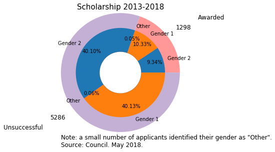
-
This pie chart shows that both the number of applications and awards is relatively balanced between Gender 1 and 2.
-
However, gender 1 takes a little bit more of applications and awards than gender 2.
Next, I will include the success rate for the whole period in barplots:
from matplotlib.ticker import MaxNLocator
from collections import namedtuple

with sns.axes_style("whitegrid", {'axes.grid' : False}):
    fig, (ax2, ax1, ax3) = plt.subplots(1,3, figsize=(16,5))

fig.suptitle('Scholarship 2013-2018', y =1, fontsize=18)

colors = ['#1F77B4','#FF7F0E'] #orange Gender_1, blue Gender_2

####################

ax1.set_title('Number of awards', fontsize=18)

sns.countplot(x=awards.Gender, ax=ax1,  palette=colors, order =  ['Gender_2', 'Gender_1'])

ax1.spines["top"].set_visible(False)
ax1.spines["bottom"].set_visible(False)
ax1.spines["right"].set_visible(False)
ax1.spines["left"].set_visible(False)


ax1.get_xaxis().tick_bottom()
ax1.get_yaxis().tick_left()
#plt.ylim(0, 30)
#plt.xlim(2013, 2018)

plt.tick_params(axis="both", which="both", bottom="off", top="off",
                labelbottom="on", left="off", right="off", labelleft="on")


for p in ax1.patches:
    ax1.annotate(np.round(p.get_height(),decimals=2), (p.get_x()+p.get_width()/2., p.get_height()),
                ha='center', va='center', xytext=(0, 10), textcoords='offset points', fontsize = 15)

plt.setp(ax1, yticks=np.arange(0, 850, step=5)) #awards


ax1.set_ylabel('')
ax1.set_xlabel('')
ax1.set_yticklabels([])
ax1.tick_params(labelsize=17)

##################
ax2.set_title('Number of applications', fontsize=18)

sns.countplot(x=df.Gender, ax=ax2, palette=colors,  order =  ['Gender_2', 'Gender_1'])

ax2.spines["top"].set_visible(False)
ax2.spines["bottom"].set_visible(False)
ax2.spines["right"].set_visible(False)
ax2.spines["left"].set_visible(False)


ax2.get_xaxis().tick_bottom()
ax2.get_yaxis().tick_left()

for p in ax2.patches:
    ax2.annotate(np.round(p.get_height(),decimals=2), (p.get_x()+p.get_width()/2., p.get_height()),
                ha='center', va='center', xytext=(0, 10), textcoords='offset points', fontsize = 15)

plt.setp(ax2, yticks=np.arange(0, 4000, step=50)) #awards

ax2.set_ylabel('')
ax2.set_xlabel('')
ax2.tick_params(labelsize=17)
ax2.set_yticklabels([])


#########


ax3.set_title('Success Rate (%)', fontsize=18)

data = suc_rate_G
sns.barplot(x = 'Gender', y = 'Suc_Rate', data=data, ax=ax3, palette=colors, order =  ['Gender_2', 'Gender_1'])


ax3.spines["top"].set_visible(False)
ax3.spines["bottom"].set_visible(False)
ax3.spines["right"].set_visible(False)
ax3.spines["left"].set_visible(False)

for p in ax3.patches:
    ax3.annotate(str(p.get_height())[0:4] + '%', (p.get_x()+p.get_width()/2., p.get_height()),
                ha='center', va='center', xytext=(0, 10), textcoords='offset points', fontsize = 15)


plt.setp(ax3, yticks=np.arange(0, 26, step=2))
ax3.set_ylabel('')
ax3.set_xlabel('')
ax3.set_yticklabels([])
ax3.tick_params(labelsize=17)

plt.text(-5.2, -5, "Note: a small number of applicants identified their the gender as \"Other\" and are not shown."
         "\n" "Source: Council. May 2018.", fontsize=15)
Text(-5.2,-5,'Note: a small number of applicants identified their the gender as "Other" and are not shown.\nSource: Council. May 2018.')
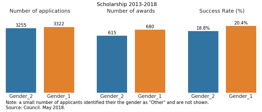
- Compared with the pie chart, we can appreciate better how gender 1 performs better than 2.
Analysis of scholarship distribution by gender per year
suc_rate_Y_G = 100*awards.groupby(["Year","Gender"] ).count()/df.groupby(["Year","Gender"]).count()
suc_rate_Y_G.rename(columns={'Status':'Suc_Rate'}, inplace=True)
suc_rate_Y_G.reset_index(inplace=True)
apps_Y_G = df.groupby(["Year", "Gender"] ).count()
apps_Y_G.rename(columns={'Applicant':'No_Apps'}, inplace=True)
apps_Y_G.reset_index(inplace=True)
awards_Y_G = awards.groupby(["Year","Gender"] ).count()
awards_Y_G.rename(columns={'Status':'No_Awards'}, inplace=True)
awards_Y_G.reset_index(inplace=True)
fig, (ax1, ax2, ax3) = plt.subplots(1,3, figsize=(17,5))

ax1.set_facecolor((1, 1, 1))
ax1.grid(color='gray', linestyle='-', linewidth=0.5)
ax2.set_facecolor((1, 1, 1))
ax2.grid(color='gray', linestyle='-', linewidth=0.5)
ax3.set_facecolor((1, 1, 1))
ax3.grid(color='gray', linestyle='-', linewidth=0.5)

ax1.spines["top"].set_visible(False)
ax1.spines["bottom"].set_visible(False)
ax1.spines["right"].set_visible(False)
ax1.spines["left"].set_visible(False)


ax2.spines["top"].set_visible(False)
ax2.spines["bottom"].set_visible(False)
ax2.spines["right"].set_visible(False)
ax2.spines["left"].set_visible(False)


ax3.spines["top"].set_visible(False)
ax3.spines["bottom"].set_visible(False)
ax3.spines["right"].set_visible(False)
ax3.spines["left"].set_visible(False)

colors = ['#FF7F0E','#1F77B4'] #orange Gender_1, blue Gender_2
gender = ['Gender_1', 'Gender_2']

for rank, column in enumerate(gender):
    # Plot each line separately with its own color, using the Tableau 20
    # color set in order.
    data_S = suc_rate_Y_G[(suc_rate_Y_G['Gender']==column)]
    ax3.plot(data_S.Year,data_S.Suc_Rate, marker='o', markersize=14, lw=3, color=colors[rank])

    y_pos_Suc = suc_rate_Y_G[(suc_rate_Y_G['Gender']==column) & (suc_rate_Y_G['Year'] == '2018')]
    ax3.text(5.2, y_pos_Suc['Suc_Rate'].values[0], column, color=colors[rank], fontsize=16)


    data_Aw = awards_Y_G[(awards_Y_G['Gender']==column)]
    ax2.plot(data_Aw.Year, data_Aw.No_Awards, marker='o', markersize=14, lw=3, color=colors[rank])

    data_Ap = apps_Y_G[(apps_Y_G['Gender']==column)]
    ax1.plot(data_Ap.Year, data_Ap.No_Apps, marker='o', markersize=14, lw=3, color=colors[rank])


ax1.set_title('Number of applications', fontsize=19)
ax2.set_title('Number of awards', fontsize=19)
ax3.set_title('Success rates (%)', fontsize=19)


ax1.tick_params(labelsize=17)
ax2.tick_params(labelsize=17)
ax3.tick_params(labelsize=17)


plt.setp(ax3, yticks=np.arange(17, 26, step=1))
#plt.setp(ax2, yticks=np.arange(20, 48, step=2))
plt.setp(ax1, yticks=np.arange(475, 650, step=25))


fig.subplots_adjust(wspace=0.35)
plt.text(-15,15,"Source: Council. May 2018.", fontsize=15)

fig.suptitle("Scholarship 2013-2018", y =1.1, fontsize=19)
Text(0.5,1.1,'Scholarship 2013-2018')
I really like these plots. They show even clearer than previous attempts, how the genders perform.
- In most years, there are more awards given to gender 1.
- The gab between genders increased in 2017, were gender 2 decreased the number of awards compared with the previous year, while the number of awards for gender 1 increased compared with the previous year. However, that year (2017), the number of applications was the most balanced.
- It’s simple to appreciate how the trends are consistent, in the sense that each year the gender that has more applications also has more awards. The gaps do change, but the overall order does not.
Global distribution of scholarships across universities
Similar to the case of gender, first I will plot global numbers on the distribution of scholarships across universities. After that, I will carry out the analysis per year.
Universities = ['University 0', 'University 1','University 2', 'University 3' , 'University 4', 'University 5', 'University 6']
Universities = sorted(Universities)
total_uni = df.loc[(df['Status'].isin(Total)) & (df['Institution'].isin(Universities))]
awards_uni = df.loc[(df['Status'].isin(Awardee)) & (df['Institution'].isin(Universities))]

total_uni = df.loc[(df['Status'].isin(Total)) & (df['Institution'].isin(Universities))]
gender_institution_year_suc_rate = awards_uni.groupby(["Gender","Institution"]).count()/total_uni.groupby(["Gender","Institution"] ).count()
gender_institution_year_suc_rate.rename(columns={'Applicant':'Suc_Rate'}, inplace=True)
gender_institution_year_suc_rate.reset_index(inplace=True)
order_unis = pd.DataFrame(data=total_uni.Institution.value_counts())
order_unis.reset_index(inplace=True)
f, (ax1, ax3, ax2) = plt.subplots(1,3, figsize=(20, 5))#, sharex=True)

f.suptitle('Scholarship 2013-2018', y =1, fontsize=18)

plt.rcParams['ytick.labelsize'] = 18
plt.rcParams['xtick.labelsize'] = 18
plt.rcParams['axes.labelsize'] = 18

#sns.set(font_scale=1.6)
ax1.spines["top"].set_visible(False)
ax1.spines["bottom"].set_visible(False)
ax1.spines["right"].set_visible(False)
ax1.spines["left"].set_visible(False)

ax2.spines["top"].set_visible(False)
ax2.spines["bottom"].set_visible(False)
ax2.spines["right"].set_visible(False)
ax2.spines["left"].set_visible(False)


ax3.spines["top"].set_visible(False)
ax3.spines["bottom"].set_visible(False)
ax3.spines["right"].set_visible(False)
ax3.spines["left"].set_visible(False)

colors = ['#FF7F0E','#1F77B4'] #orange Gender_1, blue Gender_2

sns.countplot(y=total_uni.Institution, hue=total_uni.Gender, ax=ax1, palette=colors,
              hue_order=["Gender_1", "Gender_2"], order=order_unis['index'])


# I deliverately set the tick labels

a=ax1.get_yticks().tolist()
a = ['University 0', 'University 1', 'University 2', 'University 3', 'University 4',
          'University 5', 'University 6']
ax1.set_yticklabels(a)
ax1.set_xticks([])


plt.style.use('seaborn-white')
sns.set_style("whitegrid", {'axes.grid' : False})

ax1.set_title("Number of applications", fontsize=18)
#plt.setp(ax1, ylabel='')
ax1.set_ylabel("")
ax1.set_xlabel("")

#############################################
sns.barplot(x=100*gender_institution_year_suc_rate.Suc_Rate, y = gender_institution_year_suc_rate.Institution,
            hue=gender_institution_year_suc_rate.Gender, ax=ax2, palette=colors,
              hue_order=["Gender_1", "Gender_2"],
              order=order_unis['index'])


ax2.set_title("Success rate (%)", fontsize=18)
ax2.set_ylabel("")
ax2.set_xlabel("")
plt.setp(ax2, xticks=np.arange(0, 28, step=2))
ax2.set_yticks([])
ax2.set_xticks([])


#############################################
sns.countplot(y=df.loc[df['Status'].isin(Awardee)].Institution, hue=df.loc[df['Status'].isin(Awardee)].Gender,
                ax=ax3,  palette=colors,hue_order=["Gender_1", "Gender_2"],order=order_unis['index'])


ax3.set_title("Number of awards", fontsize=18)
ax3.set_ylabel("")
ax3.set_xlabel("")
ax3.set_yticks([])
ax3.set_xticks([])


############################

ax2.legend_.remove()
ax3.legend_.remove()
ax1.legend(loc='best', fontsize=17)

f.subplots_adjust(wspace=0.4)

for i in ax1.patches:
    # get_width pulls left or right; get_y pushes up or down
    ax1.text(i.get_width()+5, i.get_y()+.3,np.round(i.get_width(),decimals=2) , fontsize=16)


for i in ax2.patches:
    # get_width pulls left or right; get_y pushes up or down
    ax2.text(i.get_width()+0.3, i.get_y()+.3, str(np.around(i.get_width(), decimals = 1)) + '%', fontsize=16)
#    print(i)


for i in ax3.patches:
    # get_width pulls left or right; get_y pushes up or down
    ax3.text(i.get_width()+0.3, i.get_y()+.3,np.round(i.get_width(),decimals=2) , fontsize=16)


ax1.set_facecolor((1, 1, 1))
ax2.set_facecolor((1, 1, 1))
ax3.set_facecolor((1, 1, 1))


plt.setp(ax1.get_yticklabels(), fontsize=18)


plt.text(-73,7,"Source: Council. May 2018.", fontsize=15)
Text(-73,7,'Source: Council. May 2018.')
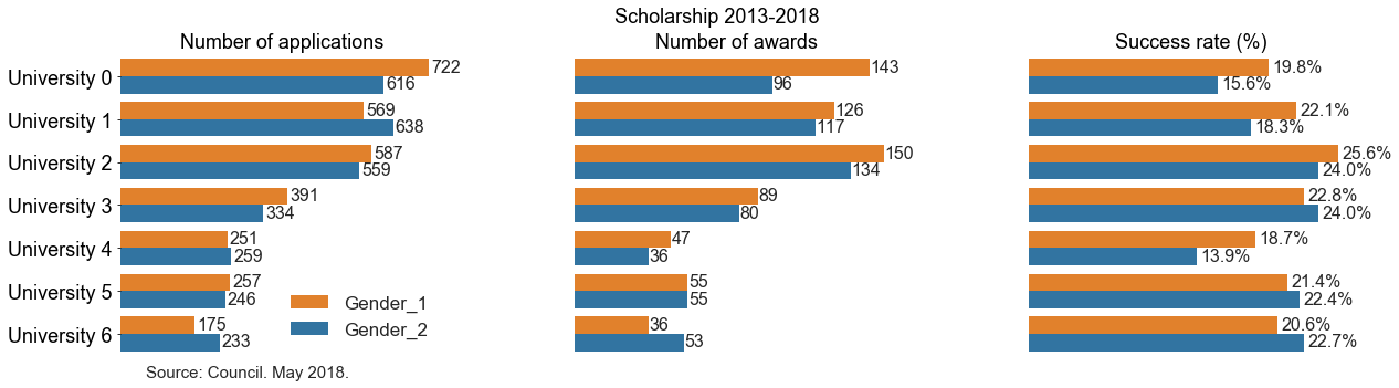
Here one can identify trends on number of applications and number of awards.
- University 0 has more applications and more awards given to gender 1. The success rate for gender 1 is higher than gender 2.
- However, look at university 4. There we have only 8 more applications for gender 2 than gender 1, but 11 more awards for gender 1.
- Also, consider University 3. There we see that there are more applications and more awards for gender 1. However, the numbers are such that gender 2 is overall more successful!
Analysis of scholarship distribution by institution per year
Again, I create variables of awards, applications and success rate using goupbyand count.
awards_Y_I = awards.groupby(["Year", "Institution"] ).count()
awards_Y_I.rename(columns={'Applicant':'No_Awards'}, inplace=True)
awards_Y_I.reset_index(inplace=True)
awards_Y_I['No_Awards'] = awards_Y_I['No_Awards'].fillna(0)
apps_Y_I = df.groupby(["Year", "Institution"] ).count()
apps_Y_I.rename(columns={'Applicant':'No_Apps'}, inplace=True)
apps_Y_I.reset_index(inplace=True)
suc_rate_Y_I = 100*awards.groupby(["Year","Institution"] ).count()/df.groupby(["Year","Institution"]).count()
suc_rate_Y_I.rename(columns={'Status':'Suc_Rate'}, inplace=True)
suc_rate_Y_I.reset_index(inplace=True)
all_institutions = sorted(df.Institution.unique())
The institutions can be divided into groups: there are universities, colleges and institutes of technology.
It turns out that only the universities have significantly large number of applications and awardees so in most of this analysis I will ignore colleges and institutes of technology.
fig, (ax2, ax1, ax3) = plt.subplots(1,3, figsize=(19,5))

ax1.set_facecolor((1, 1, 1))
ax1.grid(color='gray', linestyle='-', linewidth=0.7)
ax2.set_facecolor((1, 1, 1))
ax2.grid(color='gray', linestyle='-', linewidth=0.7)
ax3.set_facecolor((1, 1, 1))
ax3.grid(color='gray', linestyle='-', linewidth=0.7)


ax1.spines["top"].set_visible(False)
ax1.spines["bottom"].set_visible(False)
ax1.spines["right"].set_visible(False)
ax1.spines["left"].set_visible(False)


ax2.spines["top"].set_visible(False)
ax2.spines["bottom"].set_visible(False)
ax2.spines["right"].set_visible(False)
ax2.spines["left"].set_visible(False)


ax3.spines["top"].set_visible(False)
ax3.spines["bottom"].set_visible(False)
ax3.spines["right"].set_visible(False)
ax3.spines["left"].set_visible(False)


tableau20 = [(23, 190, 207), (31, 119, 180),  (255, 187, 120),     (148, 103, 189),
             (44, 160, 44), (152, 223, 138), (174, 199, 232), (255, 127, 14),(214, 39, 40), (255, 152, 150),
             (197, 176, 213), (140, 86, 75), (196, 156, 148),
             (227, 119, 194), (127, 127, 127), (199, 199, 199),
             (188, 189, 34), (219, 219, 141),  (158, 218, 229)]

# Scale the RGB values to the [0, 1] range, which is the format matplotlib accepts.
for i in range(len(tableau20)):
    r, g, b = tableau20[i]
    tableau20[i] = (r / 255., g / 255., b / 255.)


majors = sorted(Universities)


for rank, column in enumerate(majors):

###### Number of awards #####
    data_Aw = awards_Y_I[(awards_Y_I['Institution'] == column)]
    ax1.plot(data_Aw.Year, data_Aw.No_Awards, marker='o', markersize=13, lw=2, color=tableau20[rank])

###### Number of applications #####
    data_Ap = apps_Y_I[(apps_Y_I['Institution'] == column)]
    ax2.plot(data_Ap.Year, data_Ap.No_Apps, marker='o', markersize=13, lw=2,
                 color=tableau20[rank])

###### Success Rate #####
    data_Suc = suc_rate_Y_I[(suc_rate_Y_I['Institution'] == column)]
    ax3.plot(data_Suc.Year, data_Suc.Suc_Rate, marker='o', markersize=13, lw=2,
                 color=tableau20[rank])
    y_pos_Suc = suc_rate_Y_I[(suc_rate_Y_I['Institution'] == column) &
                                  (suc_rate_Y_I['Year'] == '2018')]
    x_pos_Suc = 5.2
    if (column == 'University 3'):
        y_pos_Suc['Suc_Rate'].values[0] -= 0.5
    if (column == 'University 0'):
        y_pos_Suc['Suc_Rate'].values[0] -= 0.5
    ax3.text(x_pos_Suc, y_pos_Suc['Suc_Rate'].values[0], column,color=tableau20[rank], fontsize=19)


plt.setp(ax1.get_xticklabels(), fontsize=22)
plt.setp(ax1.get_yticklabels(), fontsize=22)
plt.setp(ax2.get_xticklabels(), fontsize=22)
plt.setp(ax2.get_yticklabels(), fontsize=22)
plt.setp(ax3.get_xticklabels(), fontsize=22)
plt.setp(ax3.get_yticklabels(), fontsize=22)

fig.suptitle('Scholarship 2013-2018', fontsize=20)
ax1.set_title('Number of awards', fontsize=20)
ax2.set_title('Number of applications', fontsize=20)
ax3.set_title('Success rates (%)', fontsize=20)


fig.subplots_adjust(hspace=0.35)

plt.text(-13, 6, "Source: Council. May 2018.", fontsize=16)
Text(-13,6,'Source: Council. May 2018.')
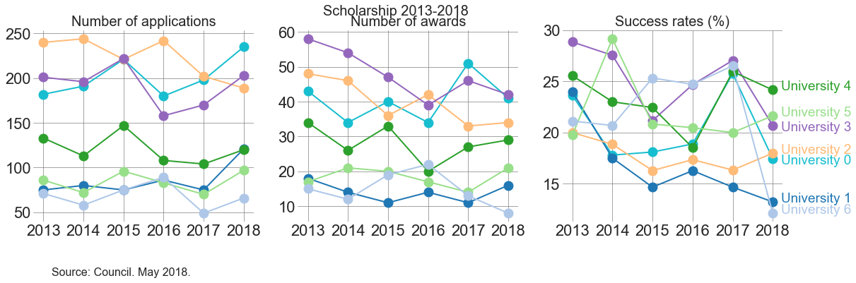
The idea here is similar to how to read the earlier plot that has information on primary area across time.
One can see how the different institutions are ordered, for a year, and compare that order across the different plots.
For example: University 4 has more applications than University 1 in each year. However, in 2016 University 1 obtained more awardees than University 4. University 1 was increasing its awards at a steeper pace than its growth in number of applications.
All universities, except for University 3 and University 5, decreased in applications from 2016 to 2017. In turn, the number of awards increased for University 3, 4 and 5. That means that the trend was not consistent only for University 4, which had less number of applications but more number of awards comparing 2016 and 2017.
Distribution of scholarship across universities considering gender
gender_institution_apps = df.groupby(["Year", "Institution", "Gender"] ).count()
gender_institution_apps.rename(columns={'Applicant':'No_apps'}, inplace=True)
gender_institution_apps.reset_index(inplace=True)
awards_gender_institution = awards.groupby([ "Year", "Institution", "Gender"]).count()
awards_gender_institution.rename(columns={'Applicant':'No_Awards'}, inplace=True)
awards_gender_institution.reset_index(inplace=True)
gender_institution_suc_rate = 100*awards.groupby([ "Year", "Institution", "Gender"]).count()/df.groupby(["Year", "Institution", "Gender"] ).count()
gender_institution_suc_rate.rename(columns={'Applicant':'Suc_Rate'}, inplace=True)
gender_institution_suc_rate.reset_index(inplace=True)
fig, ((ax1, ax2, ax3), (ax4, ax5, ax6)) = plt.subplots(nrows=2, ncols=3, figsize=(12, 8), sharex=True)


# I haven't managed to learn konw how to iterate across axes...

ax1.set_facecolor((1, 1, 1))
ax1.grid(color='gray', linestyle='-', linewidth=0.4)


ax2.set_facecolor((1, 1, 1))
ax2.grid(color='gray', linestyle='-', linewidth=0.4)


ax3.set_facecolor((1, 1, 1))
ax3.grid(color='gray', linestyle='-', linewidth=0.4)


ax4.set_facecolor((1, 1, 1))
ax4.grid(color='gray', linestyle='-', linewidth=0.4)


ax5.set_facecolor((1, 1, 1))
ax5.grid(color='gray', linestyle='-', linewidth=0.4)


ax6.set_facecolor((1, 1, 1))
ax6.grid(color='gray', linestyle='-', linewidth=0.4)


majors = sorted(Universities)

#f.subplots_adjust(hspace=0.3)


plt.tick_params(axis="both", which="both", bottom="off", top="off",
                labelbottom="on", left="off", right="off", labelleft="on")

#sns.set(font_scale=1.2)


data_1_apps = gender_institution_apps[(gender_institution_apps['Institution'].isin(majors))
                               & (gender_institution_apps['Gender'] == 'Gender_1')]

sns.pointplot(x="Year", y="No_apps", hue='Institution', data = data_1_apps, ax=ax1, palette="Set2",
              hue_order = majors)

data_2_apps = gender_institution_apps[(gender_institution_apps['Institution'].isin(majors))
                                    & (gender_institution_apps['Gender'] == 'Gender_2')]

sns.pointplot(x="Year", y="No_apps", hue='Institution', data = data_2_apps, ax=ax4, palette="Set2",
              hue_order = majors)

#######################################

data_1_awards = awards_gender_institution[(awards_gender_institution['Institution'].isin(majors))
                                    & (awards_gender_institution['Gender'] == 'Gender_1')]

sns.pointplot(x="Year", y="No_Awards", hue='Institution', data = data_1_awards, ax=ax2, palette="Set2",
              hue_order = majors)

########

data_2_awards = awards_gender_institution[(awards_gender_institution['Institution'].isin(majors))
                               & (awards_gender_institution['Gender'] == 'Gender_2')]

sns.pointplot(x="Year", y="No_Awards", hue='Institution', data = data_2_awards, ax=ax5, palette="Set2",
              hue_order = majors)


#########################################


data_1_Suc_rate = gender_institution_suc_rate[(gender_institution_suc_rate['Institution'].isin(majors))
                                    & (gender_institution_suc_rate['Gender'] == 'Gender_1')]

sns.pointplot(x="Year", y="Suc_Rate", hue='Institution', data = data_1_Suc_rate, ax=ax3, palette="Set2",
              hue_order = majors)

data_2_Suc_rate = gender_institution_suc_rate[(gender_institution_suc_rate['Institution'].isin(majors))
                               & (gender_institution_suc_rate['Gender'] == 'Gender_2')]

sns.pointplot(x="Year", y="Suc_Rate", hue='Institution', data = data_1_Suc_rate, ax=ax6, palette="Set2",
              hue_order = majors)


#labels
ax1.set(xlabel='', ylabel='')
ax2.set(xlabel='', ylabel='')
ax3.set(xlabel='', ylabel='')
ax4.set(xlabel='', ylabel='')
ax5.set(xlabel='', ylabel='')
ax6.set(xlabel='', ylabel='')


ax1.tick_params(labelsize=13)
ax2.tick_params(labelsize=13)
ax3.tick_params(labelsize=13)
ax4.tick_params(labelsize=13)
ax5.tick_params(labelsize=13)
ax6.tick_params(labelsize=13)


plt.suptitle('Scholarship 2013-2017', y=1, fontsize=18)
ax1.set_title('Number of applications')
ax2.set_title('Number of awards')
ax3.set_title('Success rate (%)')


ax3.text(6, 20,'Gender_1', fontsize=16)
ax6.text(6, 20, 'Gender_2', fontsize=16)

plt.text(-15, -5, "Source: Council. May 2018.", fontsize=14)

#plt.setp(ax1, yticks=np.arange(10, 175, step=10))
plt.setp(ax4, yticks=np.arange(20, 160, step=20))


plt.setp(ax2, yticks=np.arange(0, 35, step=5))
plt.setp(ax5, yticks=np.arange(0, 40, step=5))


plt.setp(ax3, yticks=np.arange(5, 40, step=5))
plt.setp(ax6, yticks=np.arange(5, 40, step=5))


# I set all but one legend visible=False, knowing that the one I left True will be consistent so the colours
# because I set the hue_order in each plot!


ax1.legend().set_visible(False)
ax2.legend().set_visible(False)
ax3.legend().set_visible(False)
ax4.legend().set_visible(False)
ax5.legend().set_visible(False)
ax6.legend(handles, labels, loc=(2,0.7), fontsize=14)
---------------------------------------------------------------------------

NameError                                 Traceback (most recent call last)

<ipython-input-53-b5855af8fc1a> in <module>()
    137 ax4.legend().set_visible(False)
    138 ax5.legend().set_visible(False)
--> 139 ax6.legend(handles, labels, loc=(2,0.7), fontsize=14)


NameError: name 'handles' is not defined
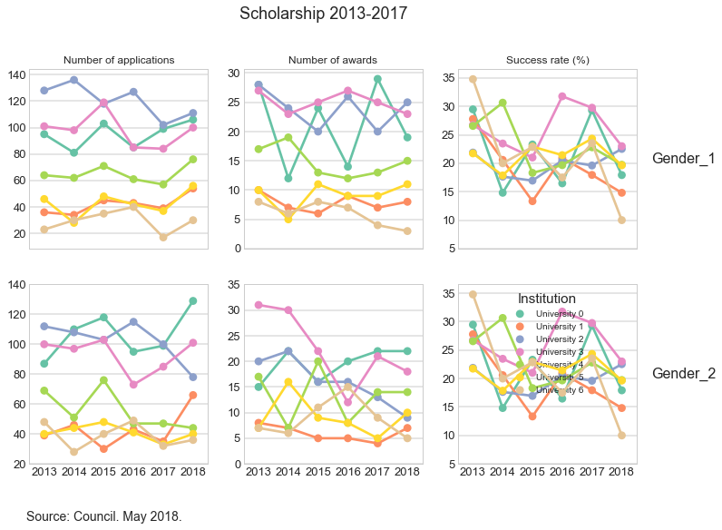
In the previous plot, I deliberately changed the labels in legend in order to mask the data. This may be wrong, but this is just a post to show the type of exploratory analysis I carried out.
Persevere and succeed
There are applicants who applied more than once before being successful. Others were successful in their first attempt. Let us look at these cases.
To be continued…