This project is part of my learning experience with Dataquest.io where I’m practising using basemap.
1. Geographic Data
The datasets were obtained from Openflights.org.
Let’s load pandas and the datasets provided by Dataquest.io:
import pandas as pd
airlines = pd.read_csv("airlines.csv")
airports = pd.read_csv("airports.csv")
routes = pd.read_csv("routes.csv")
With the following commands I can print out the first row of each DataFrame
print(airlines.iloc[0])

print(airports.iloc[0])

print(routes.iloc[0])
id                       1
name        Private flight
alias                   \N
iata                     -
icao                   NaN
callsign               NaN
country                NaN
active                   Y
Name: 0, dtype: object
id                              1
name                       Goroka
city                       Goroka
country          Papua New Guinea
code                          GKA
icao                         AYGA
latitude                 -6.08169
longitude                 145.392
altitude                     5282
offset                         10
dst                             U
timezone     Pacific/Port_Moresby
Name: 0, dtype: object
airline         2B
airline_id     410
source         AER
source_id     2965
dest           KZN
dest_id       2990
codeshare      NaN
stops            0
equipment      CR2
Name: 0, dtype: object
4. Workflow With Basemap
import matplotlib.pyplot as plt
from mpl_toolkits.basemap import Basemap

m = Basemap(projection='merc',
            llcrnrlat= -80,
            urcrnrlat = 80,
            llcrnrlon = -180,
            urcrnrlon = 180)
You can check out all of the parameters for Basemap. Here’s some comments:
projection: the map projection.llcrnrlat: latitude of lower left hand corner of the desired map domainurcrnrlat: latitude of upper right hand corner of the desired map domainllcrnrlon: longitude of lower left hand corner of the desired map domainurcrnrlon: longitude of upper right hand corner of the desired map domain
5. Converting From Spherical to Cartesian Coordinates
The constructor (m) takes only list values, so I can convert longitude and latitude columns from the airports dataframe to lists with Series.tolist().
long = airports['longitude'].tolist()
lat = airports['latitude'].tolist()
Now long and lat lists can be used in a Cartesian coordinate system (since we want the map in 2 dimensions with the Mercador projection). The following will covert the spherical coordinates to Cartesian coordinates.
x, y = m(long, lat)
And now I scatter plot the basemap m:
m.scatter(x, y, s = 1)
plt.show()

7. Customizing The Plot Using Basemap
We can add costal lines to the map:
m = Basemap(projection='merc', llcrnrlat=-80, urcrnrlat=80, llcrnrlon=-180, urcrnrlon=180)
longitudes = airports["longitude"].tolist()
latitudes = airports["latitude"].tolist()
x, y = m(longitudes, latitudes)
m.scatter(x, y, s=1)
m.drawcoastlines()
plt.show()
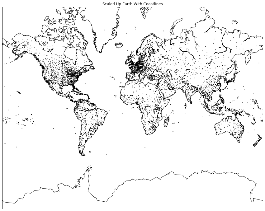
8. Customizing The Plot Using Matplotlib
We can add a title and change the size of the figure
m = Basemap(projection='merc', llcrnrlat=-80, urcrnrlat=80, llcrnrlon=-180, urcrnrlon=180)
longitudes = airports["longitude"].tolist()
latitudes = airports["latitude"].tolist()
x, y = m(longitudes, latitudes)
fig, ax = plt.subplots(figsize = (15, 20))
ax.set_title('Scaled Up Earth With Coastlines')
m.scatter(x, y, s=1)
m.drawcoastlines()
plt.show()
9. Introduction to Great Circles
Dataquest.io have another dataset prepared to draw flight routes with great circles. Great circles would be the route of a flight appropriately projected on the 2-dimensional map with the Mercator projection.
geo_routes = pd.read_csv('geo_routes.csv')
geo_routes.info()
print(geo_routes.head(5))
<class 'pandas.core.frame.DataFrame'>
RangeIndex: 67428 entries, 0 to 67427
Data columns (total 8 columns):
airline      67428 non-null object
source       67428 non-null object
dest         67428 non-null object
equipment    67410 non-null object
start_lon    67428 non-null float64
end_lon      67428 non-null float64
start_lat    67428 non-null float64
end_lat      67428 non-null float64
dtypes: float64(4), object(4)
memory usage: 4.1+ MB
  airline source dest equipment  start_lon    end_lon  start_lat    end_lat
0      2B    AER  KZN       CR2  39.956589  49.278728  43.449928  55.606186
10. Displaying Great Circles
Now the idea is to write a function, named create_great_circles() that takes a dataframe and draws a great circle for each route that has an absolute difference in the latitude and longitude values less than 180. And then apply it for a specific airport.
fig, ax = plt.subplots(figsize=(15,20))
m = Basemap(projection='merc', llcrnrlat=-80, urcrnrlat=80, llcrnrlon=-180, urcrnrlon=180)
m.drawcoastlines()
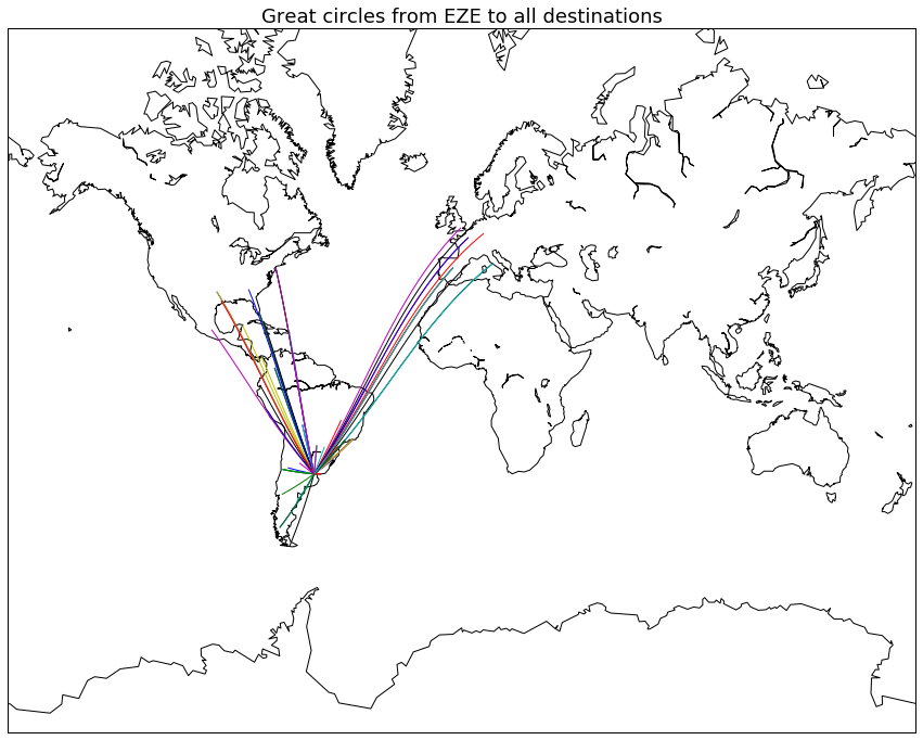
This is the function that I wrote
def create_great_circles(dataframe):
    for row in dataframe.iterrows():
        if (row[1][7] - row[1][6] < 180) & (abs(row[1][5] - row[1][4]) < 180):
            m.drawgreatcircle(row[1][4], row[1][6], row[1][5], row[1][7])
The iterator iterrows gives a series, so taking row[1] selects the actual list of things that I want, since row[0] is the dataframe index. Once I have row[0] I can select the column that I want – not by its name such as end_latitude, but as the column number because now it’s an array and not a series.
My solution above is a bit messier than the function that dataquest.io presented as the answer:
def create_great_circles(df):
    for index, row in df.iterrows():
        end_lat, start_lat = row['end_lat'], row['start_lat']
        end_lon, start_lon = row['end_lon'], row['start_lon']

        if abs(end_lat - start_lat) < 180:
            if abs(end_lon - start_lon) < 180:
                m.drawgreatcircle(start_lon, start_lat, end_lon, end_lat)
But anyway, I used my function and chose EZE airport, Ministro Pistarini International Airport in Argentina:
dfw = geo_routes[geo_routes['source']=='EZE']
create_great_circles(dfw)
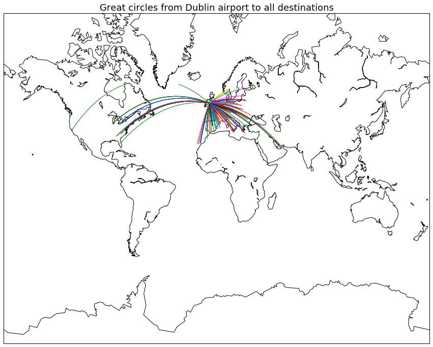
And here’s the version with Dublin airport:
fig, ax = plt.subplots(figsize = (15, 20))
ax.set_title('Great circles from DUB (Dublin) airport to all destinations', fontsize=18)
m = Basemap(projection='merc', llcrnrlat=-80, urcrnrlat=80, llcrnrlon=-180, urcrnrlon=180)
m.drawcoastlines()

def create_great_circles(dataframe):
    for row in dataframe.iterrows():
        if (row[1][7] - row[1][6] < 180) & (abs(row[1][5] - row[1][4]) < 180):
            m.drawgreatcircle(row[1][4], row[1][6], row[1][5], row[1][7])

dfw = geo_routes[geo_routes['source']=='DUB']
create_great_circles(dfw)